Canada Emergency Business Account
The Canada Emergency Business Account (CEBA) was a critical government initiative introduced in response to the COVID-19 pandemic. Designed to support small businesses affected by the economic downturn, CEBA provided interest-free loans to eligible businesses to help cover operating costs during the crisis.
Client
Big 5 Canadian Bank
Year
2020
As the lead UX designer for the CEBA application portal at the bank, I spearheaded the design process to create an intuitive and efficient platform for small businesses to access critical financial support. Leveraging my expertise in user-centered design principles, I crafted a user-friendly interface that guided applicants through the application process step by step, ensuring clarity and ease of use.
Strategic Design Approaches Under Tight Deadlines
Due to the urgent time constraints, following in-depth discussions with the business team, I opted to approach this design challenge from three distinct perspectives:
Utilize existing client-facing platforms within the bank to devise a streamlined and rapid client verification method.
Acknowledge the pressing needs of the applicants by maintaining a highly straightforward flow throughout the process.
Offer supportive guidance to business owners, facilitating their understanding of the required information to be provided.
Design Highlights
Confirm applicant type meticulously
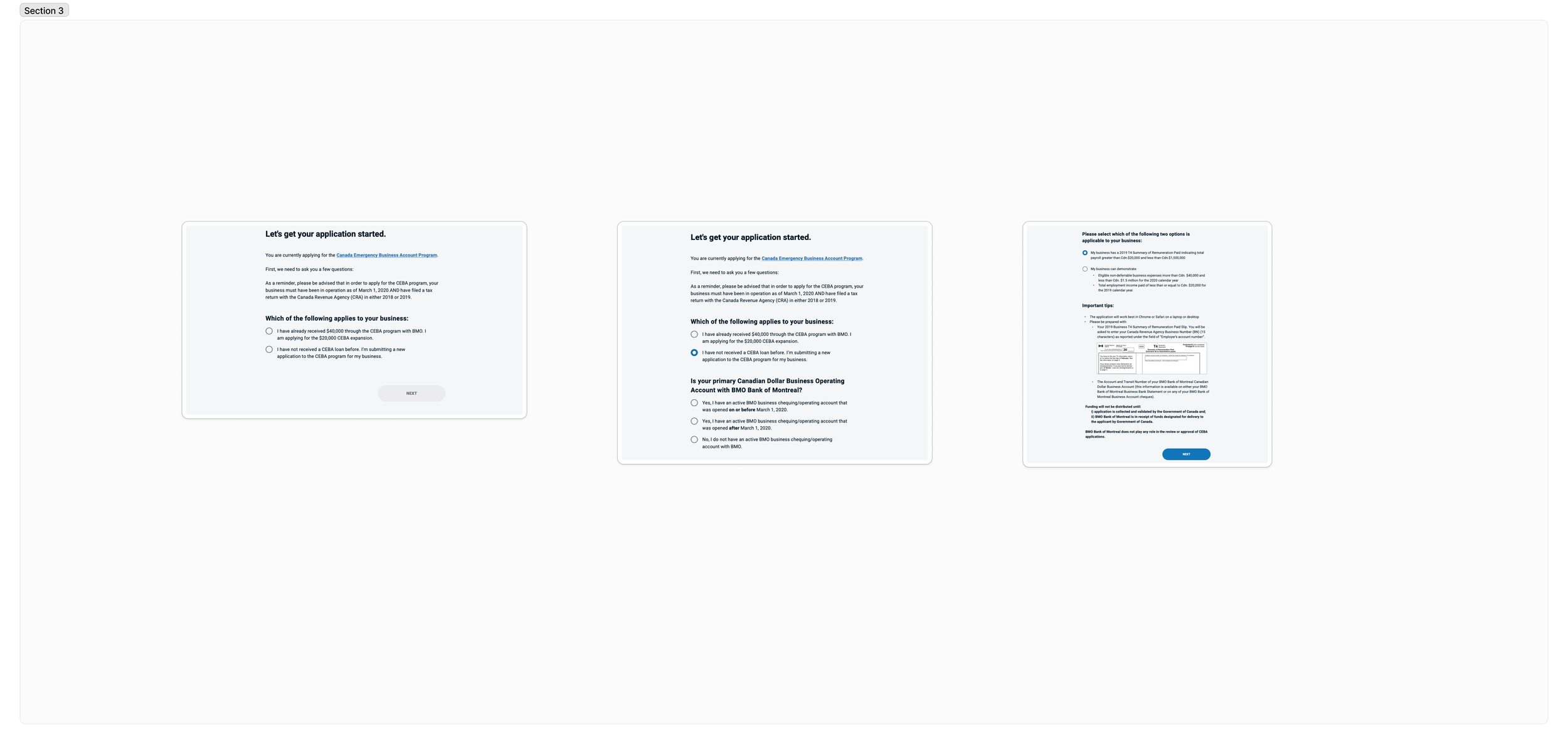
Through a meticulously crafted questionnaire spanning three intuitive steps, I devised a method to accurately determine clients' eligibility for the Canada Emergency Business Account (CEBA), while also identifying their specific applicant type. This structured approach ensured clarity and precision in categorizing applicants, enabling seamless processing and efficient distribution of financial support during critical times.
Efficiency Enhancements through Visual Guidance
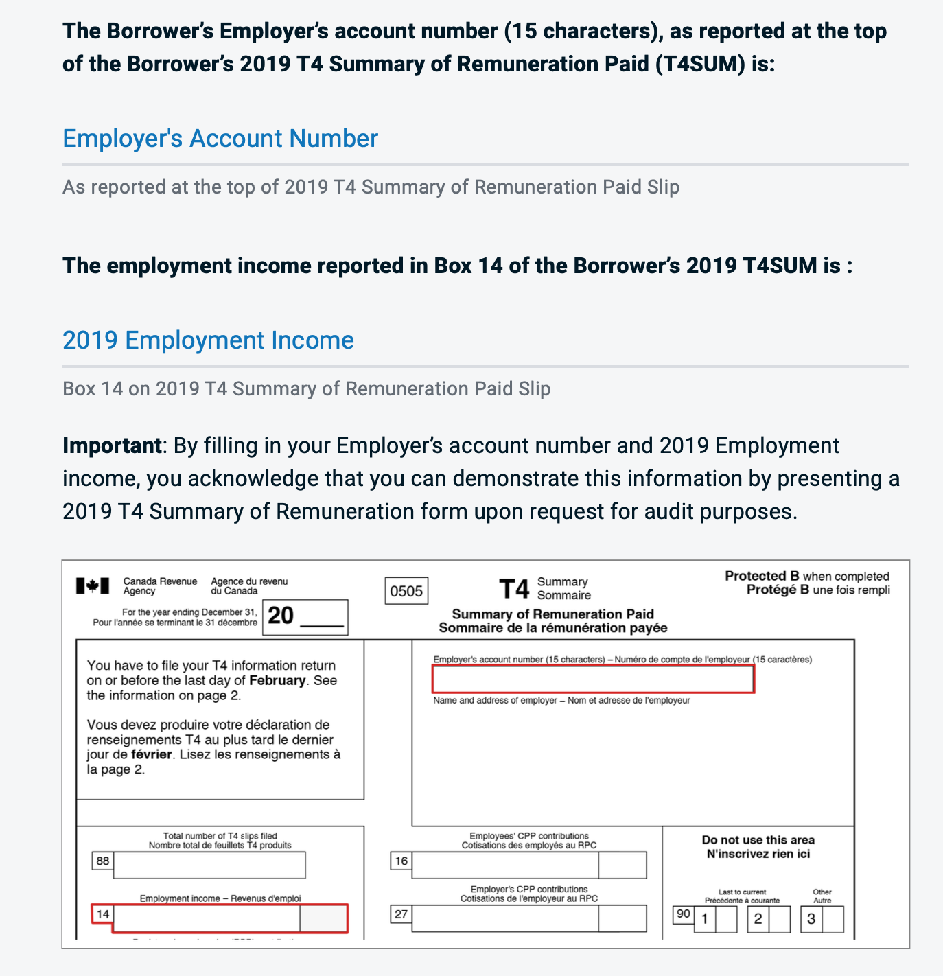
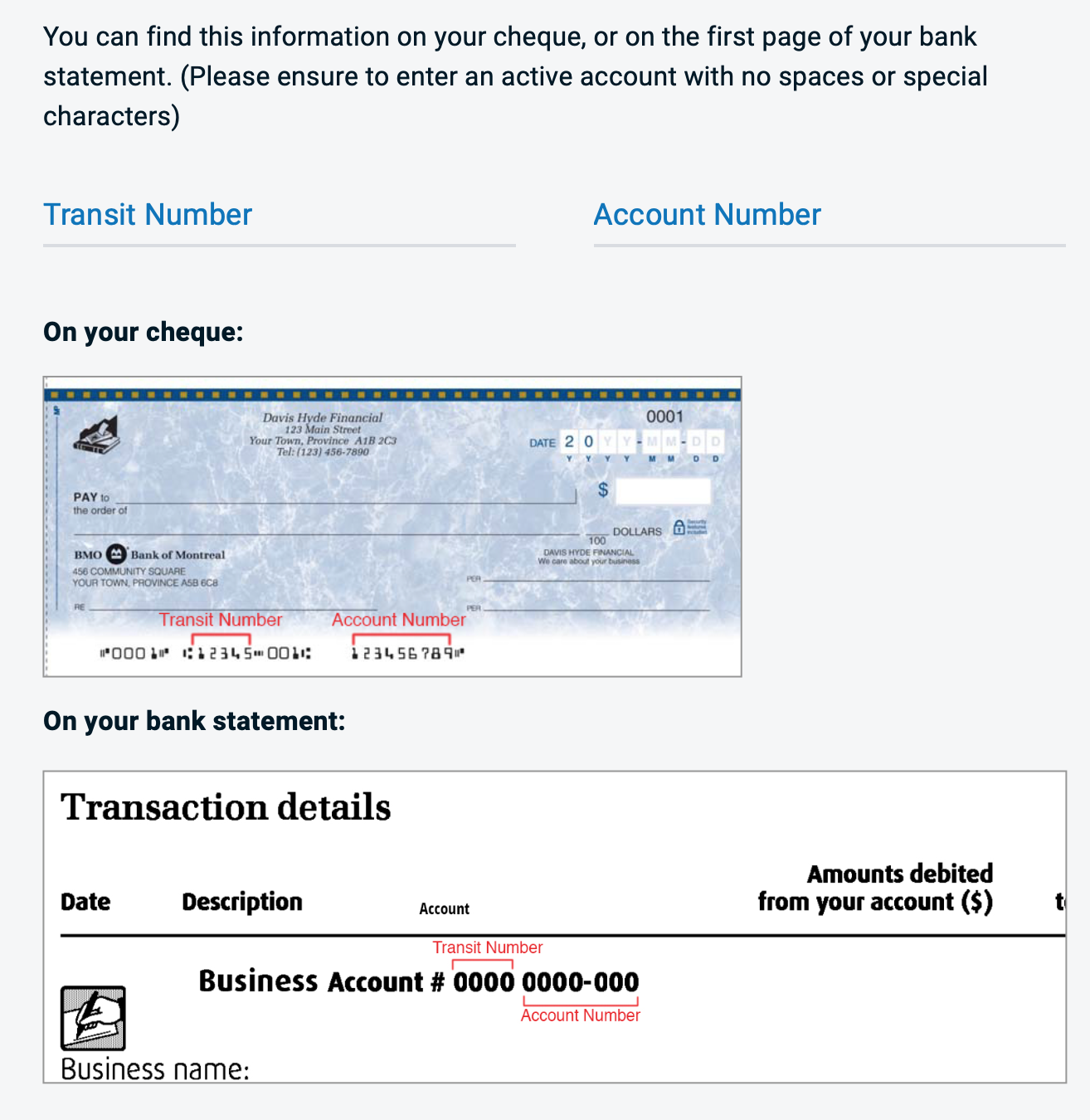
Required tax forms were accompanied by screenshots, clearly indicating which fields to reference. This visual guidance not only assisted clients in completing their applications accurately but also significantly reduced the time spent on consultations with call centre members.
By empowering users to navigate the application process with confidence and clarity, we streamlined operations and alleviated pressure on support staff, ultimately enhancing overall efficiency and user satisfaction.
Clear progress indicator and message to keep client informed
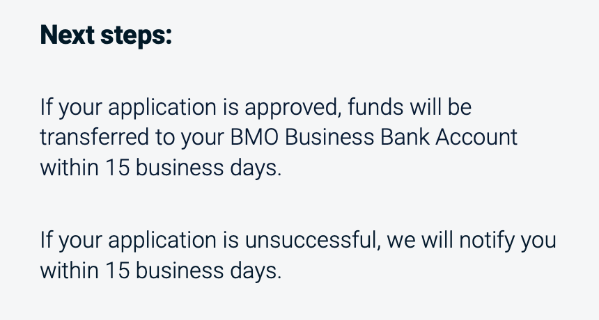
In the CEBA application portal design, I prioritized user transparency and engagement by incorporating a clear progress indicator and informative messages throughout the process. This feature ensured that clients were constantly aware of their current position in the application journey and what steps remained ahead. Additionally, contextual messages were strategically placed to provide guidance, reassure users of their progress, and address any potential concerns. By keeping clients informed every step of the way, we fostered a sense of trust and confidence in the platform, ultimately leading to a smoother and more satisfying user experience.


